How to Pair Fonts That Work Together
Good font pairing works on contrast with harmony: pick one font for headings and another for body text that differ clearly in style but share a similar mood and proportions, which is why a classic pairing is one serif with one sans-serif.
By Mubasher Hussain · Published 2026-07-28 · Updated 2026-10-08 · 1072 words · about 5 minute read
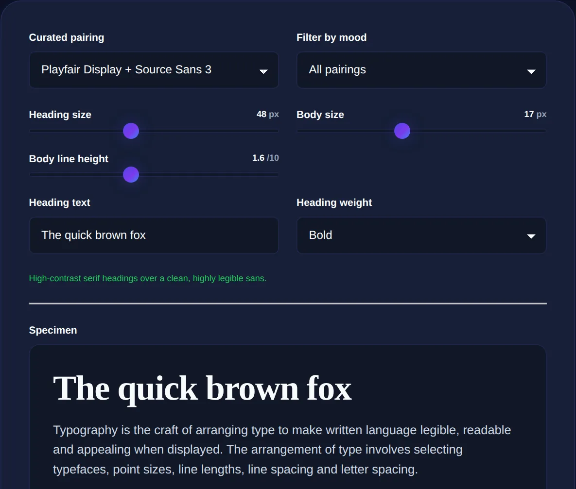
Pairing fonts, choosing one typeface for headings and another for body text, is one of the trickiest parts of design for non-designers, because the difference between a combination that feels harmonious and one that feels off can be hard to articulate. Yet good font pairing is one of the strongest signals of professional design. The Font Pairing Tool lets you preview combinations in your browser, and this article explains the principles that make fonts work together.
The goal of pairing is contrast with harmony: the two fonts should be different enough to create a clear hierarchy between headings and body, but related enough to feel like they belong in the same design. Getting that balance is what the strategies below are for.
Why some combinations clash
Fonts clash when they are too similar or too different in the wrong ways. Two fonts that are almost but not quite alike create an uncomfortable tension, the eye senses a difference it cannot resolve. Two fonts that share too many strong personality traits compete for attention rather than establishing a hierarchy. And fonts from wildly different eras or moods, a playful script beside a rigid technical face, can feel jarring unless the contrast is deliberate. Good pairing avoids these by choosing fonts whose relationship is clear: clearly contrasting in role, clearly compatible in feel.
The reliable pairing strategies
A few dependable approaches take the guesswork out of pairing:
- Pair a serif with a sans-serif: the classic combination, contrasting form (with and without the small strokes on letters) while both remain readable. A serif heading over sans-serif body, or vice versa, almost always works.
- Use one font family in different weights: a bold weight for headings and a regular weight for body from the same family guarantees harmony, since they are literally designed together.
- Contrast style but match mood: pick two fonts that differ in structure but share a personality, like two modern faces, one geometric and one humanist.
- Let one font dominate: make one the clear star and the other a supporting player, rather than two equally assertive fonts.
Two fonts is plenty for most designs; three is a maximum. Beginners often reach for too many typefaces, which fragments a design. A single well-chosen font in varied sizes and weights is more professional than a jumble of different ones.
Contrast creates hierarchy
The practical purpose of using two fonts is to establish hierarchy, to make headings clearly distinct from body text so readers can navigate the content. This is why contrast matters: if the heading font is too similar to the body font, the hierarchy is weak and the page feels flat. The contrast can come from the serif-versus-sans distinction, from a large difference in weight, or from size. Often the simplest and safest hierarchy uses one font family with strong size and weight differences, which sidesteps pairing entirely while still giving clear structure.
Readability comes first
However striking a pairing looks, the body font must above all be readable at length, because that is where most of the reading happens. Save distinctive, characterful fonts for headings, where they appear briefly and make an impression, and choose a clean, comfortable font for body text that does not tire the eye over paragraphs. A beautiful heading font used for body text is a common mistake that hurts readability. The clarity of the writing matters too, which a readability checker helps with, typography and prose work together to make content easy to read.
Preview heading and body font combinations together to find pairings that work, entirely in your browser.
Typography within a design system
Font pairing is one part of a coherent visual system alongside color and spacing. Just as a color palette gives colors defined roles, a font pairing gives typography a clear structure of heading and body. And just as color needs sufficient contrast to be legible, type needs adequate size and contrast against its background to be readable. Consistent typography, the same pairing, sizes and weights used throughout, is a major contributor to a design feeling unified and intentional.
Type scale and hierarchy beyond the font choice
Choosing two harmonious fonts is only half of good typography; how you size and space them matters just as much, and often more. A clear type scale, a consistent set of sizes for headings, subheadings, body and captions, is what creates readable hierarchy and rhythm on a page. Without it, even a beautifully chosen pairing looks disorganised. The sizes should differ enough to be clearly distinct, so a heading reads unmistakably as a heading, but relate to one another in a deliberate progression rather than being picked at random.
Line height and line length are the other quiet determinants of readability. Body text needs generous line height, comfortably more than the font's own size, so lines do not feel cramped, and a line length of roughly sixty to seventy-five characters is easiest to read, because very long lines make it hard for the eye to find the start of the next one while very short lines break the text up too much. These spacing decisions frequently do more for how professional and readable a design feels than the specific fonts do. A single well-chosen font, sized on a clear scale with comfortable line height and sensible measure, will almost always look better than an inspired font pairing thrown together with inconsistent sizes and cramped spacing. So while pairing fonts is worth doing well, it is best understood as one part of a larger typographic system in which scale, spacing and rhythm carry much of the weight, and where restraint and consistency reliably beat cleverness.
In summary, good font pairing balances contrast and harmony: fonts different enough to create a clear heading-and-body hierarchy but compatible enough to belong together. Reliable strategies include pairing a serif with a sans-serif, using one family in different weights, or matching mood while contrasting structure, and when in doubt, using fewer fonts. Always keep the body font highly readable and reserve character for headings. Preview combinations before committing, apply your chosen pairing consistently, and typography becomes one of the clearest marks of a polished, professional design.