Color Contrast and Accessibility: Meeting WCAG
Why contrast matters for real people, what the WCAG ratios mean, and how to make sure your text is readable by everyone.
By Mubasher Hussain · Published 2026-07-31 · Updated 2026-09-01 · 1064 words · about 5 minute read
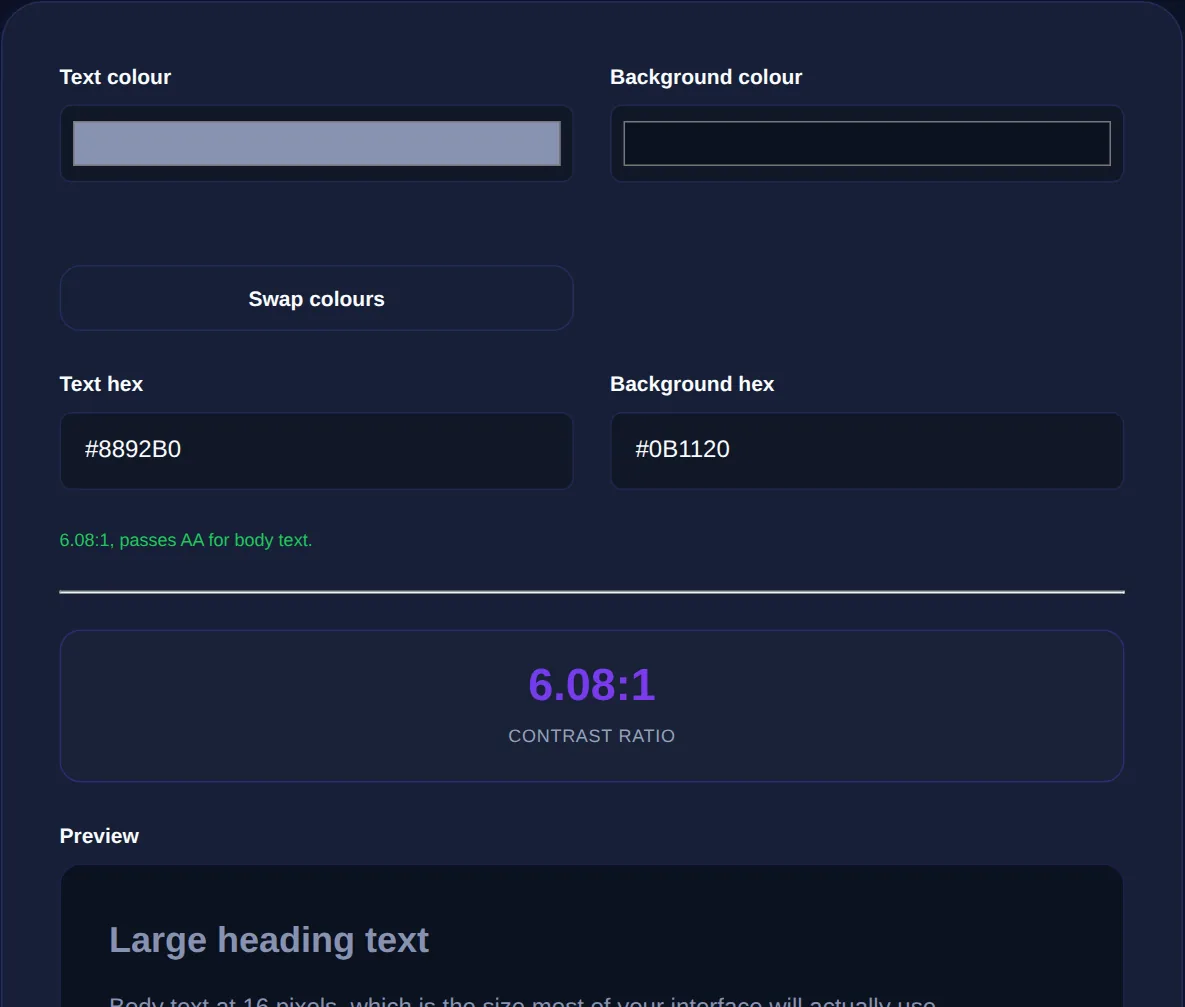
Color contrast is the difference in brightness between text and its background, and it determines whether people can actually read your content. Low-contrast text, light grey on white, say, may look elegant to a designer with a good monitor in a dark room, but it is a barrier for many real users. The Contrast Checker measures the ratio between two colors and tells you whether it meets accessibility standards, and this article explains why contrast matters and what the standards mean.
Accessibility is not a niche concern. Contrast affects people with low vision or color blindness, older users whose eyesight has changed, and anyone using a phone in bright sunlight or a cheap screen. Good contrast helps everyone, which is why it is codified into standards that many sites are legally required to meet.
Why contrast matters for real people
A significant portion of the population has some form of visual impairment, reduced acuity, color blindness, or age-related changes, and low-contrast text is genuinely hard or impossible for them to read. But the benefit is universal: everyone struggles with faint text on a glary phone screen outdoors, or on a projector, or when tired. Designing for sufficient contrast is not about accommodating a minority at the expense of aesthetics; it is about making content readable in the wide range of real conditions and abilities your audience actually has. Elegant-looking but unreadable text fails at the one job text has.
What the WCAG ratios mean
The Web Content Accessibility Guidelines (WCAG) define contrast as a ratio between the brightness of two colors, ranging from 1:1 (identical, invisible) to 21:1 (black on white, maximum). The key thresholds are:
- 4.5:1: the minimum for normal body text to meet the widely-used AA level.
- 3:1: the minimum for large text (roughly 18pt, or 14pt bold) at AA, and for meaningful graphics and UI components.
- 7:1: the stricter AAA level for normal text, for enhanced accessibility.
Large text gets a lower threshold because its size already aids readability. These numbers are not arbitrary, they come from research into how much contrast people with a range of vision need to read comfortably.
You cannot reliably judge a contrast ratio by eye, because perception is affected by surrounding colors and your own screen and eyesight. The ratio is a precise calculation from the two colors' brightness, always measure it rather than guessing.
Meeting the standard in practice
Achieving good contrast is straightforward once you measure it. Check every important text-and-background combination in your design against the relevant threshold, and adjust the colors until they pass. Usually this means darkening the text or lightening the background (or vice versa), often just nudging the lightness in HSL is enough to cross the threshold while keeping the color's character. Do not forget states and components: link colors, button text, placeholder text, disabled states and icons all need adequate contrast, and these are commonly overlooked.
Contrast and color blindness
Contrast also intersects with color blindness, which affects a notable share of people, most commonly red-green. The practical lesson is never to rely on color alone to convey information, a red-versus-green status that looks obvious to you may be indistinguishable to a color-blind user. Pair color with another cue like text, an icon or a pattern, and ensure the brightness contrast is sufficient regardless of hue. Sufficient contrast helps here too, because even when hues are confused, a difference in brightness remains perceptible.
Check the contrast ratio between any two colors against WCAG AA and AAA levels, entirely in your browser.
Building accessibility in from the start
The easiest time to get contrast right is while choosing colors, not after the design is finished. Building a palette with contrast in mind, ensuring your text colors clear the thresholds against your backgrounds from the outset, avoids painful rework later. Readability is broader than contrast, too: a readability checker addresses the clarity of the writing itself, which works hand in hand with visual legibility. Accessible design is simply good design that happens to work for more people.
Contrast for interface elements, not just text
Accessibility guidance on contrast is often discussed only in terms of body text, but the same principle extends to the interactive and informational parts of an interface, and these are frequently overlooked. Buttons, form field borders, focus outlines, icons that convey meaning, and the boundaries of controls all need to be distinguishable from their surroundings. The relevant threshold for these non-text elements is generally lower than for body text, around three to one, but it is a real requirement, because a form field whose border melts into the background is genuinely hard to locate for someone with reduced vision.
Focus indicators deserve particular attention. When someone navigates a page by keyboard rather than mouse, the focus outline is how they know where they are, and a faint or missing focus style makes a site unusable for them. That outline must have adequate contrast against both the element and the page. Similarly, if you use colour to show state, a required field, an error, a selected item, the colour difference must be strong enough to perceive, and, crucially, must not be the only signal, since colour-blind users may not distinguish it at all. Pairing the colour with an icon, a label or a shape change covers everyone. Treating contrast as a whole-interface concern rather than a text-only checkbox is what separates a design that is technically compliant from one that is genuinely usable, and it tends to produce clearer, more confident interfaces for every user, not only those with impairments.
To recap: color contrast decides whether text is readable, and adequate contrast helps not just people with visual impairments but everyone in real-world conditions. WCAG sets measurable thresholds, 4.5:1 for normal text, 3:1 for large text and UI, 7:1 for enhanced accessibility, that you should check rather than eyeball. Adjust colors to meet them, cover every text state and component, never rely on color alone, and build contrast in from the palette stage. Do that and your content becomes readable by the widest possible audience, which is exactly what it is there to be.