CSS Gradients Explained: How to Create Beautiful Backgrounds
How linear and radial gradients work, why they are resolution-independent, and how to build ones that look good.
By Mubasher Hussain · Published 2026-07-24 · Updated 2026-09-01 · 1034 words · about 5 minute read
A CSS gradient is a smooth blend between two or more colours, generated by the browser and used as a background without any image file. From subtle button shading to vivid full-page backdrops, gradients are everywhere in modern web design because they are lightweight, infinitely scalable and easy to adjust. The Gradient Generator lets you build one visually and copy the CSS in your browser, and this article explains how gradients work and how to make ones that look good.
Because a gradient is drawn by the browser from a short line of CSS rather than loaded as a picture, it stays razor-sharp at any size and can be changed in an instant, advantages a background image cannot match.
Linear versus radial gradients
The two most common gradient types differ in how the colours flow. A linear gradient blends colours along a straight line, in a direction you choose, top to bottom, left to right, or any angle. It is the workhorse for backgrounds, buttons and banners. A radial gradient blends outward from a central point in circles or ellipses, like a glow or a spotlight, useful for drawing the eye to a focal point or creating soft, rounded lighting effects. Choosing between them is mostly a matter of the shape of blend you want: directional flow versus outward radiance.
Colour stops: the heart of a gradient
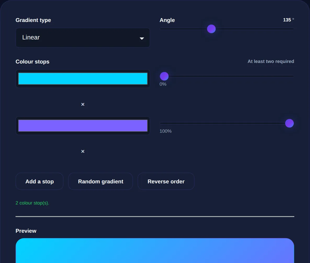
Every gradient is defined by colour stops, the colours in the blend and the positions where each sits. With two stops you get a simple blend from one colour to another. Add more stops and you can create multi-colour transitions, control exactly where each colour peaks, and even create hard edges by placing two stops at the same position. The positions, given as percentages along the gradient, let you weight the blend, placing a colour stop at 20% rather than 50% makes that colour occupy less of the space. Mastering stops is what turns a flat two-colour fade into a rich, deliberate design.
The most professional gradients are often the most restrained, two closely-related colours, or a gentle shift in brightness. Wildly clashing colours in a gradient can look garish. Blending shades of the same hue, or neighbouring hues, tends to look polished.
Why gradients beat background images
Before CSS gradients, a colour blend meant exporting an image from a graphics program and loading it as a background. Gradients replaced that with several concrete advantages. They add no extra file to download, so they do not slow the page. They are resolution-independent, staying perfectly smooth on any screen size or pixel density, where an image would need multiple versions and could look blurry or banded. And they are trivial to tweak, changing a colour is editing a line of CSS, not re-exporting an asset. For flat colour blends, gradients are simply better than images in every practical way.
Building a gradient that looks good
A few principles produce attractive gradients:
- Start with two colours that harmonise, shades of one hue, or adjacent hues on the colour wheel.
- Consider the direction: top-to-bottom feels natural, a diagonal feels more dynamic.
- Use colour stops to control where the blend happens, not just which colours are used.
- Keep contrast in mind if text will sit on top, the gradient must not make the text unreadable anywhere across its span.
- Test on the actual element size, since a gradient can look different on a small button versus a full page.
Build linear and radial CSS gradients visually and copy the code, entirely in your browser. Nothing is uploaded.
Gradients in a wider design system
Gradients rarely stand alone; they work best as part of a coherent colour scheme. Start by choosing your colours with a color picker and building a harmonious set with a color palette generator, then blend those brand colours into gradients. Gradients are also a foundation for popular effects like the frosted-glass look, which a glassmorphism generator builds on top of a colourful gradient background. Used consistently, a signature gradient becomes part of a brand's visual identity.
Advanced gradient techniques
Once the basics of linear and radial gradients are comfortable, a few techniques unlock more sophisticated effects. Layering multiple gradients on top of one another, using transparency, lets you build complex, textured backgrounds from simple parts, a subtle radial highlight over a linear base, for instance, mimics soft lighting. Placing two colour stops at the same position creates a hard edge rather than a blend, which is how gradients can produce stripes and geometric patterns rather than smooth fades. And conic gradients, which sweep colour around a centre point like a colour wheel, enable effects such as pie-chart segments and angular highlights.
Restraint remains the guiding principle even as the techniques grow more capable. The gradients that read as polished and professional are usually the understated ones, a gentle two-colour fade, a barely-there highlight, a shift between neighbouring shades, while busy, high-contrast combinations quickly look amateurish. A good workflow is to build the effect visually, see it on the actual element at its real size, and copy the generated CSS rather than hand-writing the syntax, which is fiddly and easy to get wrong. Keeping any text over a gradient readable across its whole span is the one hard constraint to respect. With those habits, build visually, stay restrained, protect legibility, and lean on layering and stop positioning for richer effects, CSS gradients give you a remarkably expressive, entirely code-based way to add depth and personality to a design without a single image file.
To sum up: CSS gradients are browser-drawn colour blends that come in linear and radial forms, defined by colour stops that control which colours appear and where. They beat background images by adding no file weight, scaling perfectly to any screen, and being instantly editable. Build them from harmonious colours, use stops deliberately, keep any overlaid text readable, and tie them into a wider palette, and you get beautiful, lightweight backgrounds from a single line of CSS.